Breaking the Cycle of Swivel-Chairing: The Case for a Centralized Team Dashboard
The Cost of "Swivel-Chairing" in Software Development
In many software teams, developers and managers juggle a plethora of tools – issue trackers, code repositories, CI/CD dashboards, knowledge bases, chat applications, and more. Constantly switching between these systems (often called "swivel-chairing") comes at a high cost. Research shows that developers switch tasks frequently: one study of professional devs found 59% of their daily tasks are switched, and 29% of those interrupted tasks are never resumed. Every interruption or context switch fragments focus. In fact, a typical developer's workday is often chopped into many short sessions (15–30 minutes each) due to these interruptions. Once derailed, it takes a considerable amount of time to regain momentum – on average 9.5 minutes to get back into a productive flow after toggling between digital apps. Other studies put this recovery time even higher, at up to 23 minutes to fully refocus after a major interruption. The bottom line: frequent context switching drains productivity, with the American Psychological Association estimating up to a 40% drop in productive output from heavy multitasking.
The impact isn't just time lost in the moment; it also increases the cognitive load on developers. When jumping between, say, Jira for issue updates, GitHub for pull requests, Slack for messages, and a dozen browser tabs for documentation, the brain has to "unload and reload" context repeatedly. This leads to what researchers call attention residue – part of your mind remains stuck on the previous task even as you attempt the next. Developers often feel this as mental fatigue or that "productivity tax" you pay after too many back-to-back context switches. It's no surprise nearly 45% of workers say that bouncing between apps hamstrings their efficiency. A joint survey by Qatalog and Cornell University quantified the toll: professionals spend about 36 minutes per day just switching between tools, and up to 59 minutes a day searching for information across those siloed applications. That's almost 5 hours a week lost simply navigating tool overload – time that could be spent coding, reviewing, designing, or thinking deeply about problems.

Given these challenges, it's clear why reducing context switching is critical. One emerging solution is to centralize the workflow – bring the information from those multiple tools into a single unified interface. This is where a centralized team dashboard comes in. By serving as an integrated hub for all your development work, a dashboard promises to break the swivel-chair cycle and let you spend more time on actual development work and less on navigating between apps.
What Is a Centralized Team Dashboard?
A centralized team dashboard is essentially a single-pane-of-glass that aggregates data and updates from the various tools developers use. Instead of manually checking Jira for your open tickets, GitHub for pull request updates, your bookmarks for important links, and so on, the dashboard pulls those into one place. Dashflow.dev is an example of such a dashboard – it connects to your GitHub and (optionally) Jira accounts, and presents an overview of your development activities and resources in one unified view.
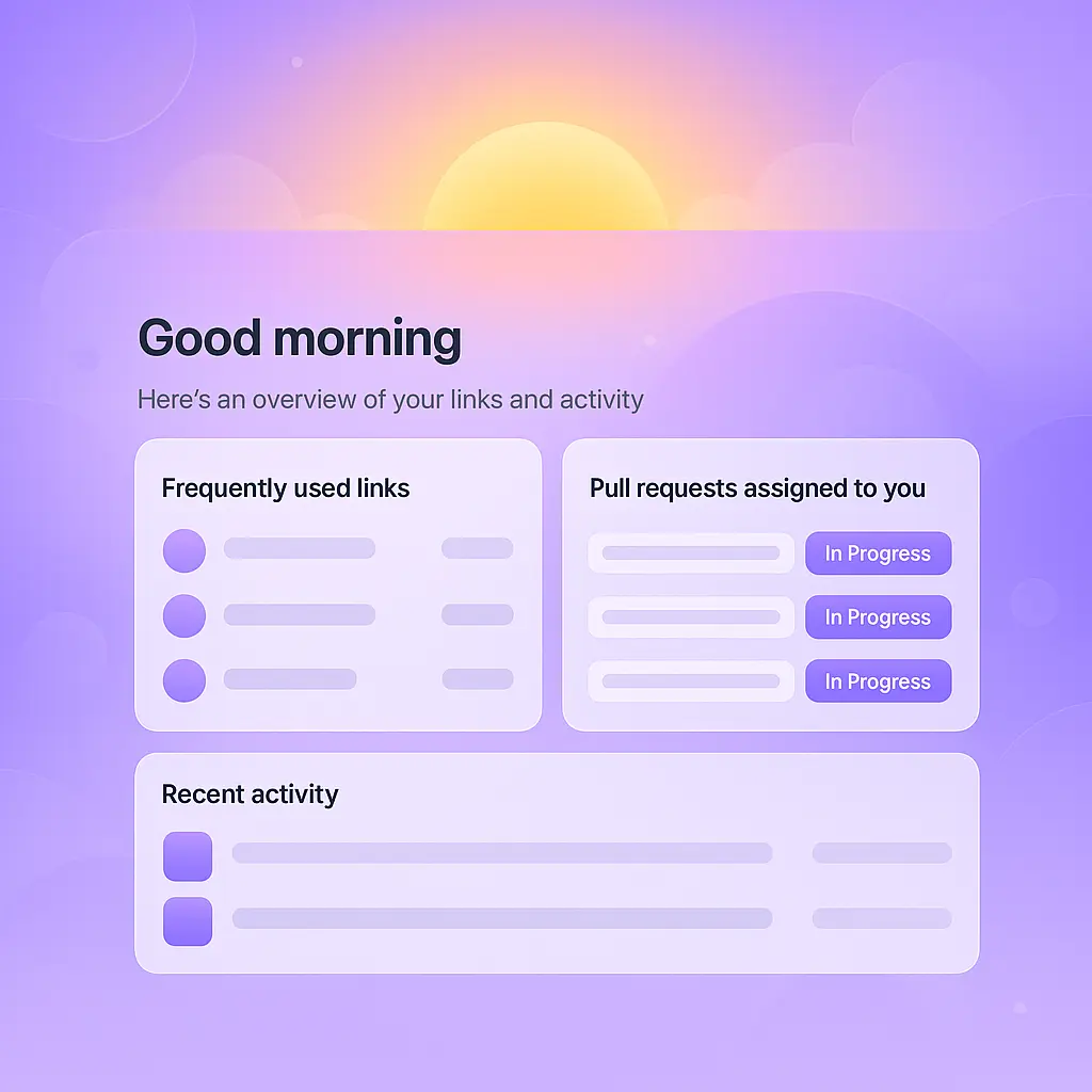
Unlike generic business dashboards that focus on high-level KPIs, a developer-centric dashboard like Dashflow is tailored to day-to-day workflow. It typically includes: your open or assigned pull requests (so you know which code reviews need attention), your assigned or in-progress tickets/issues from the project tracker, a feed of recent activity (commits pushed, comments made, CI results, etc.), and often a place to store or quickly access important links and documentation. In short, it's a personalized homepage for your development work. Team leads and managers can use such dashboards to get a quick pulse of project progress and team activity, while individual developers use it to organize their daily tasks without constantly Alt-Tabbing through different sites.
Key Benefits of a Unified Development Dashboard
Centralizing your tools into a single dashboard can yield numerous benefits for both developers and their managers. Here are some of the main advantages:
- Reduced Context Switching and Faster Workflow: By having everything in one place, you dramatically cut down on the need to switch apps. You're not navigating from your code repo to your task tracker to your wiki and back. This saves the mental reboot time between tasks. For example, if workers currently toggle between 10–15 different browser tabs or applications, that's potentially dozens of micro-interruptions per day. A unified dashboard minimizes this friction, helping engineers stay in flow. Over a week, the reclaimed minutes add up – potentially several hours of productivity regained. As one engineering lead noted, when you can work in one environment, it's "easier to avoid context switching overhead" and "get into that productive mindset and stay there". In practice, developers using a centralized dashboard spend less time clicking around and more time writing and reviewing code.
- Greater Visibility and No Lost Tasks: A dashboard provides at-a-glance visibility into your work. It's hard for a task to fall through the cracks when your dashboard prominently lists all your assigned PRs and tickets. In contrast, if you rely on email notifications or disparate tool UIs, it's easy to miss something – for instance, an approver might overlook a pull request amidst GitHub email clutter, or a developer might forget a Jira ticket that's buried in a backlog query. The dashboard surfaces all these items in one view, so nothing gets forgotten. This consolidated visibility also helps in prioritization: you can see everything on your plate and tackle the most urgent items first. Managers similarly get a broad view of team progress without needing to manually collate reports from different systems.
- Time Savings in Information Gathering: Developers waste significant time searching for the right page or updating multiple systems. A well-integrated dashboard slashes that overhead. Need to check the spec document or staging URL? If it's saved in the dashboard's links section, it's one click instead of digging through bookmarks or chat histories. Want to know if a teammate merged a PR? Just glance at the activity feed instead of opening GitHub and finding the repository. These small conveniences compound. Studies indicate employees spend nearly 20% of their time just searching for and gathering information – time that can be won back. In short, the dashboard becomes your one-stop shop, dramatically reducing the scavenger hunt across tools.
- Improved Decision Making and Responsiveness: With a centralized view, developers and team leads can make decisions faster. For example, if the dashboard's insights show that a particular project's PRs are piling up, a lead can spot that trend in real time and redistribute code review duties before it becomes a blocker. Or if a critical Jira issue is linked (via the integration) to a PR that's still open, you can immediately identify that dependency. This holistic perspective prevents the situation where one team member is heads-down coding, unaware that another is waiting on their review to proceed. Everyone stays on the same page, which leads to quicker resolutions and fewer late surprises. Essentially, a dashboard improves situational awareness for the whole team.
- Data-Driven Insights and Continuous Improvement: Beyond just listing items, many dashboards provide analytic views of your work patterns. Dashflow, for instance, offers activity insights – visual charts of your commits over time, distribution of pull requests across repositories, and link usage patterns. These metrics can be valuable. A developer might notice they have a spike of activity in the afternoons, and arrange their day to protect that block for deep work. A manager might observe that a certain type of task (e.g. documentation PRs) languishes longer and investigate why. The integrated data can reveal bottlenecks or opportunities. Moreover, by tracking trends (say, how many PRs were merged this week vs last), teams can measure the impact of process changes and incrementally improve. In contrast, when data is siloed, it's a hassle to combine it for any insights – meaning such analysis often doesn't happen.
- Lower Cognitive Load and Less Stress: This benefit is a bit intangible but critical. Developers often keep mental checklists ("Don't forget to deploy that service… Follow up on that code review… Update the Jira ticket after closing the bug…"). A centralized dashboard offloads much of that cognitive burden onto the tool – it becomes an external memory of sorts for your work. You can trust that the important items will be visible when you look at your dashboard. This can reduce the anxiety of "Did I miss something?" that comes with having too many places to check. By simplifying and decluttering the work environment, developers can focus more fully on one thing at a time, which not only boosts productivity but can also improve job satisfaction (there's nothing fun about spending half your day clicking around instead of creating). In the long run, teams that tame context switching tend to have happier, less burned-out developers.
Key Features to Look For in a Team Dashboard
Not all dashboards are created equal. What capabilities make a centralized team dashboard truly effective for reducing swivel-chairing? Below are some key features – all of which are exemplified by Dashflow.dev – that one should look for:
- Tight Integration with Development Tools: The dashboard should connect to the systems you already use – primarily your source code platforms (e.g. GitHub, GitLab, Bitbucket) and issue/project trackers (e.g. Jira, Trello). Native integration ensures it can pull in real-time data like open pull requests, issue statuses, and comments. For example, Dashflow connects via OAuth to your GitHub account and Jira account (if you choose). This allows it to fetch your assigned PRs and issues automatically. Deep integration means the dashboard stays up-to-date without manual data entry. When evaluating a tool, check what integrations are available and that they cover the critical parts of your workflow. A dashboard that can't connect with one of your key systems will end up with gaps in information – forcing you to switch context back to that system, which "essentially defeats the purpose of the dashboard."
- Pull Request and Ticket Tracking: A core purpose of the dashboard is to surface your actionable work items. A good dashboard will have dedicated sections or widgets for pull requests and for tickets/issues. Dashflow, for instance, shows a "Pull requests assigned to you" panel, listing PRs you need to review or that are awaiting your action. It also can display Jira issues assigned to you (through its Jira integration) on your main screen or a dedicated tickets page. This means at any moment you can glance and see "I have 3 PRs to review and 2 open Jira tasks." Some dashboards also aggregate related info like build status or CI checks for those PRs, or allow filtering by repository or priority. The goal is to make it impossible to forget a code review request or an urgent bug fix, because they're all right there in front of you.
- Link Aggregation and Knowledge Hub: Teams often have a set of important links they frequently use – for example, the staging environment URL, the API documentation site, the project's Jira board, the CI/CD pipeline page, Google Docs specs, etc. Developers can waste time searching through chat or wikis for these links. A strong dashboard provides a "Most Used Links" section (or bookmark manager) that is easily accessible. Dashflow's dashboard, for example, lets you save personal links and even tracks how often you click them to bubble up the most frequent ones. On a team plan, members can share organization-wide links (like common resources) visible to everyone. This link aggregation turns the dashboard into the portal for all key resources – you log in to the dashboard in the morning and launch everything from there, rather than maintaining a messy browser bookmarks bar or repeatedly Googling the same internal pages. It's a simple feature, but it can save a surprising amount of time and reduce frustration.
- Combined Activity Feed and Notifications: Keeping track of all the latest updates is easier when they're unified in one feed. A useful dashboard will provide an activity stream that pulls events from multiple sources – code pushes, comments on your PRs, ticket status changes, etc. Dashflow includes a "Recent Activity" feed showing a timeline of recent GitHub events (like opened/merged PRs, comments, new commits) as well as your latest commits across repositories. This can typically be filtered (e.g. show only code commits or only Jira updates). Instead of monitoring multiple notification channels, you have one cohesive view. This not only saves time, it also provides context – for example, you might see in the feed that a teammate commented on your PR and also that a related Jira issue moved to QA, giving you a full picture of what's happening before you even start work. Some dashboards also send smart reminders or daily summary emails, which can be handy for managers to stay informed without digging around.
- Insightful Analytics and Trends: As mentioned earlier, dashboards that offer analytics provide additional value beyond aggregation. Look for features like productivity insights, team metrics, or trends over time. Dashflow's "Data Insights" include visual charts of your daily coding activity, the breakdown of pull requests by repository, and link usage stats. These can reveal patterns (e.g., "most of my PRs are in Repo X, maybe we need to spread knowledge more") or personal habits (e.g., "I commit code mostly in the evenings, is that optimal?"). Other tools might implement the SPACE framework metrics (measuring developer Satisfaction, Performance, Activity, Collaboration, and Efficiency) or integration-specific stats like cycle time for PRs. While not every team needs fancy charts, having data available in the dashboard means you don't have to run separate reports or query multiple systems to get basic insights. For engineering managers, this can drastically simplify reporting and highlight issues proactively (such as a sudden drop in commit activity or a growing queue of open reviews).
- Collaboration and Sharing Features: In a team setting, the dashboard should support collaboration. That could mean the ability to share the view with others, or team-wide elements like shared links as mentioned, or even shared dashboards. Dashflow's Teams plan, for example, allows an organization owner to manage members and shared resources on the dashboard. This ensures everyone sees consistent information and can contribute to a common pool of links or references. Some dashboards also integrate chat or commenting features (e.g., you might comment on a dashboard item and @mention a colleague). While not strictly necessary, these features further reduce the need to switch to another app (like email or Slack) to discuss something that's visible on the dashboard.
In summary, an effective centralized dashboard should integrate seamlessly, surface all critical work items, provide quick access to resources, and offer useful context/insights. If any of these pieces are missing, you might still find yourself doing the swivel-chair dance. For instance, a dashboard that shows code activity but not tickets might still force managers to check Jira for the full picture; or a dashboard that doesn't allow link saving might not actually reduce how often you search for things. The best solutions cover the key bases so you truly can use it as a one-stop hub.
Dashflow vs. Alternatives: How Does It Stack Up?
It's worth comparing the centralized dashboard approach to other common methods of managing development work:
- Manual Tracking (Spreadsheets or To-Do Lists): Some developers try to keep personal to-do lists or spreadsheets of tasks (for example, writing down their assigned Jira issues or PRs to review each day). While this can work for personal organization, it's a manual effort that easily becomes outdated. It also doesn't scale – tasks change state in real time and a static list won't capture that. Manual tracking also introduces double work: you're effectively copying information from the source (Jira, etc.) into your own tracker, which is the kind of repetitive data entry a dashboard automates. In today's fast-paced teams, manual tracking tends to be error-prone (you might forget to log an item or mark it done) and ultimately ends up being yet another thing to maintain. A live dashboard like Dashflow eliminates the need for this by automatically aggregating tasks and updates. The manual approach might suffice for a lone developer on a very small project, but for most professional teams it quickly becomes a headache.
- Relying on Individual Apps Separately: The status quo at many organizations is to use each tool in isolation – developers check the Jira board for their tasks, get GitHub email notifications or use the GitHub website for PRs, maybe bookmark a Jenkins dashboard for build status, etc. This can certainly be done, but as we've discussed, it incurs a heavy context-switch tax. You have to remember to check all the places continuously. Important information can be siloed; for example, your GitHub might not "know" about the Jira ticket priority, so if you forget to check Jira you might miss that a high-priority bug was filed. Moreover, toggling between 10 different browser tabs all day is mentally exhausting (indeed, one study found employees switch between 13 separate apps, 30 times per day on average). Using each app's native interface also means navigating different UIs and notifications styles, which can be inefficient. Dashflow's advantage here is that it unifies the critical info from Jira and GitHub (and potentially other tools) into one coherent interface, drastically reducing the need to bounce around. Think of it like a command center: you log into Dashflow and you're essentially logging into Jira+GitHub at once, because their data is pulled in.
- Browser Bookmarks and Multitude of Tabs: A variant of the above is when developers use a combination of bookmarks, pinned tabs, or browser sessions to keep important pages open (like one tab for Jira backlog, one tab for GitHub notifications, etc.). This "poor man's dashboard" at least keeps things a click away, but it's still not integrated – you might have 5+ tabs you cycle through repeatedly. It's easy to get lost or close a tab and lose your place. And it doesn't provide any unified features like a combined feed or cross-tool insights. In contrast, a single dashboard webapp or window can replace that clutter, and smart dashboards might highlight things (e.g., a number badge if new items appear) which a static bookmark won't do.
- Using Communication Tools as a Pseudo-Dashboard: Another approach teams take is to funnel notifications from various tools into a group chat or email. For example, you might have Slack integrations that post a message whenever a Jira ticket is assigned or a PR is opened. This can centralize awareness in a sense – you see all updates in Slack – but it often becomes noisy and hard to manage. Chat channels can get flooded, making it easy to overlook an important update (especially if you're offline for a bit and come back to hundreds of messages). There's also limited ability to track state; a Slack message tells you something happened but doesn't give you a dashboard view of current open tasks. It's more like a firehose of events. Some teams also use email inbox rules to collect tool notifications, but email overload is a well-known problem. Compared to these, a dedicated dashboard like Dashflow is purpose-built to organize information in a digestible way (sections, filters, etc., rather than one giant chronological scroll of mixed events). It also typically presents a persistent view of items (e.g., showing all outstanding PRs until they're resolved), whereas a chat message about a PR will disappear off-screen quickly. That said, Dashflow and similar tools can complement chat – for example, one could still get Slack pings for high-priority items, but rely on the dashboard for the day-to-day overview.
- Other All-in-One Solutions or Dashboards: Dashflow is not the only player attempting to unify developer workflows. There are other methods like internal developer portals (e.g., some companies use frameworks like Backstage by Spotify to create an internal tooling hub), or other SaaS products that integrate dev tools. Each solution has its pros/cons. An internal portal can be highly customized to a company's needs (including integrating in-house systems), but requires significant effort to build and maintain – usually only large organizations have the resources for that. Generic project management platforms might offer integrations (for instance, Asana or Monday.com can integrate with GitHub or Jira to some degree), but they may not be tailored to developers' needs specifically (they often cater more to project managers and lack code-specific views like PR diffs or commit history). Other engineering analytics tools (like Hatica, LinearB, etc.) focus on metrics and may not function as a daily work dashboard for individual devs. Compared to these, Dashflow is lightweight and focused on personal/team productivity rather than executive reporting. It strikes a middle ground by being ready-to-use (SaaS with minimal setup) while targeting the key dev workflows. Of course, every team's needs differ: if a team already lives inside an IDE that surfaces all these things (like VS Code with many extensions), they might not need a separate dashboard. But for teams where work is spread across web apps and services, Dashflow's centralized approach is a welcome convergence of those streams.
In summary, the alternatives to a centralized dashboard either involve a lot of human effort to keep things in sync (manual methods) or a lot of mental juggling to monitor multiple channels (using tools separately). A product like Dashflow aims to automate the information aggregation and present it in a developer-friendly way, thus addressing the shortcomings of those alternatives. By reducing tool sprawl and the "app-switching" fatigue, it directly tackles the pain points quantified by productivity research (like the hours lost to context switching each week).
Challenges and Considerations in Adopting a Team Dashboard
While the benefits of a centralized dashboard are compelling, it's important to acknowledge potential challenges and counterpoints – not every team will magically become more productive overnight just by adding a dashboard. Here are a few considerations:
- Onboarding and Adoption: One practical challenge is getting everyone on the team to actually use the new dashboard consistently. Developers are creatures of habit; someone might be used to just living in their email or checking Jira and may forget to check the dashboard initially. It takes a bit of habit-forming for the dashboard to deliver full value. This can be mitigated by making the dashboard the browser start page or installing it as a lightweight app, and by leadership reinforcing its use (for example, managers might say "please ensure your dashboard is clear of any high-priority items daily"). The good news is that if the tool is well-designed and clearly saving people time, they will naturally gravitate to it after the initial adjustment period.
- Integration Gaps: As hinted earlier, a dashboard is only as good as its integrations. If your team uses some niche or custom tool that isn't supported, that data might still require a context switch. For instance, if your QA uses a separate test case management system not linked to Jira, those might not show up on the dashboard. Or if not all repositories are accessible via the integration (say, due to permissions), some PRs could be missing. These gaps can erode confidence in the tool ("I still have to check system X anyway, so why bother with the dashboard?"). Before adopting, it's wise to audit what tools your team uses and ensure the dashboard can connect to the critical ones. Dashflow currently focuses on GitHub and Jira – which covers a lot of ground for many software teams – but if your environment includes other major systems, you'd want to check for roadmap or workarounds. The makers of Dashflow seem aware of this, as they suggest future plans like automatically linking PRs to mentioned Jira tickets, indicating an intent to deepen integration. Still, one should approach any tool with a clear understanding of what it will and won't aggregate. In scenarios where something isn't integrated, you may decide to continue a manual process for that or explore custom integration if possible. Just remember that if you find yourself manually inputting data to the dashboard to bridge gaps, that "defeats the purpose" of having an automated dashboard, so integration completeness is key.
- Information Overload vs. Relevance: Centralizing information is a double-edged sword – you want everything in one place, but you don't want everything all at once to the point of overwhelm. There is a risk that a dashboard could bombard the user with too much data or notifications if not configured properly. For example, seeing all commits from every team member might be unnecessary noise for an individual developer only interested in their stuff or their team's. Good dashboards allow filtering and personalization (Dashflow, for instance, lets you filter the activity feed by type). It's important to take advantage of those settings so the dashboard shows what's relevant. A counterpoint sometimes raised is that developers might actually benefit from less multitasking, not more – so will adding yet another tool help? The key distinction is that the dashboard is meant to simplify, not add complexity. If a team sets it up without thoughtful curation, it could turn into just another stream of noise. Thus, ensure the dashboard is tuned to highlight important items (assigned to you, @mentioning you, high priority, etc.) and perhaps de-emphasize or hide purely informational updates that aren't actionable. When used right, the dashboard should reduce overload by structuring information, not contribute to it.
- No Silver Bullet – Some Context Switching Remains: It's worth acknowledging that even with a great dashboard, context switching won't vanish entirely (and some would argue a little context switching can spur creativity or prevent monotony). Developers will still need to dive into specialized tools for deep work: for example, clicking on a pull request in Dashflow will likely take you to GitHub to do the detailed code review; or you might open the IDE to write code for the Jira ticket you saw in the dashboard. The dashboard's goal is to minimize unnecessary toggling, not eliminate the need for all other tools. In essence, it handles the monitoring and coordination aspect of work, but the execution (coding, testing, designing) still happens in their respective environments. This is fine, but teams should set the right expectation – the dashboard is there to streamline awareness and tracking, not to replace your IDE or the full Jira interface. There may still be moments you have to "swivel" out of the dashboard (e.g., to configure a complex Jira workflow or to run a deployment script). The hope is that those are conscious, planned switches for focused work, rather than frenetic back-and-forth just to see what's going on.
- Tool Fatigue and Cultural Acceptance: Some skeptics might point out that adding a dashboard sounds like adding another tool to the already long list, potentially exacerbating tool fatigue. It's a valid caution – if the dashboard doesn't truly reduce the usage of other apps, it could become one more thing to check. This is why tight integration and possibly bi-directional updates are important (for instance, if you could comment on a Jira ticket from the dashboard itself, it saves a trip to Jira entirely – though Dashflow's current focus seems read-centric with quick links out to the source for actions). It's crucial that the dashboard replaces certain habits rather than adds to them. When introduced, it's helpful to simultaneously streamline processes: for example, "We will use Dashflow – and by doing so, maybe turn off some redundant email notifications or stop posting GitHub spam in Slack – so that the dashboard is the primary channel for tracking." Without that, you risk duplicating information channels. Culturally, managers should use the dashboard to communicate and review work status rather than asking people to report status in meetings or separate docs – otherwise, the dashboard could be seen as redundant. However, when adopted as the source of truth for what everyone is doing, it can actually reduce the overall tool clutter (you might find you no longer need that Excel status sheet or that weekly roundup email, because the dashboard covers it). It's all about replacing manual reporting with the dashboard's automated tracking.
- Privacy and Trust: A minor point to consider is that dashboards that aggregate activity might feel a bit like "monitoring" to some team members. For instance, if a manager can see every commit and ticket in one place, some developers could worry it's a surveillance tool. This is more about company culture than the tool itself – healthy engineering cultures use such dashboards for empowering teams and individuals (to self-manage and identify issues) rather than micromanaging. In the case of Dashflow, the primary user is the developer themselves (it's your dashboard). And on team plans, it's more about sharing links and basic info, not about performance scoring. Still, it's wise for managers to frame the dashboard as a productivity aid, not a scorecard. When introduced and used transparently, most developers will appreciate the convenience and not mind the visibility. But it's always good to ensure the data shown is not overly intrusive – e.g., showing someone's "idle time" or something would be negative; Dashflow does not do anything like that, focusing on work artifacts instead.
In evaluating counterpoints, one might come across the argument that productivity tools themselves can create distraction if overused. As one commentary put it, the proliferation of apps has "institutionalized the practice of controlled distraction" – meaning we've added so many tracking tools that they interrupt real work. There is truth in that if we pile on too many separate tools. The virtue of a centralized dashboard, however, is that it consolidates and reduces the number of interfaces one has to deal with. In other words, it's an antidote to tool overload rather than a contributor, provided it's implemented to replace some of the fragmented workflows. The net gain should be positive: fewer browser tabs, fewer notifications in disparate places, and a calmer, more organized workspace. Teams should periodically assess: is the dashboard actually saving us time and mental effort? If configured well, the answer will likely be yes. If not, refine what's shown or integrate more sources until it does.
Conclusion
In today's complex development environments, where a single feature might involve a GitHub pull request, a Jira story, a Jenkins build, and a Confluence page, the potential for context switching is enormous. A centralized team dashboard like Dashflow.dev offers a way to tame that complexity by bringing the relevant pieces together. The benefits – from recovering hours of lost productivity each week, to ensuring no task slips through unnoticed, to making life easier for both engineers and managers – are backed by both research and real-world anecdotes. Developers can regain focus and flow by minimizing the "swivel-chair" jumps between tools, and managers get better visibility without constantly pestering the team for updates.
Of course, a dashboard isn't a magic wand. It works best when it mirrors the needs of the team and when the team embraces it as the go-to hub for their work. There may be some initial inertia to overcome and some integration wrinkles to iron out. But as the data has shown, the status quo of scattered tools carries hidden costs – fragmented attention, lost time, duplicated effort, and even higher error rates. Consolidating your toolchain into a single interface is one of the most actionable steps you can take to reduce those inefficiencies. It aligns with a broader industry trend as well: major platforms are recognizing the issue, from GitHub enabling more in-IDE operations to productivity suites trying to interconnect apps. The ultimate vision is a development workflow that flows smoothly, with minimal "alt-tab tax."
In comparing Dashflow to alternatives, it's clear that while one could struggle on with manual methods or an array of separate apps, there is a better way. By integrating GitHub, Jira, and other key components, tracking PRs and tickets in one place, aggregating useful links, and revealing insights about your work, Dashflow and similar dashboards help developers spend more time doing what they do best – building software – and less time playing tool traffic-cop. The result is not just higher productivity, but also a more satisfying work experience: you end the day feeling productive rather than frazzled by constant context switches.
For teams and developer leads looking to boost efficiency and reduce the cognitive load on their engineers, adopting a centralized dashboard is a smart move. The evidence in favor of reducing context switching is overwhelming, and the technology to do so is readily available. In the final analysis, a well-implemented team dashboard turns the ideal of "working smarter, not harder" into everyday reality – freeing you from the chaos of tool overload and allowing you to focus on delivering value. It's time to break the swivel-chair cycle and let a unified dashboard keep the busywork under control. Your team's focus and sanity will be all the better for it.
Sources
- Shakeri Hossein Abad et al., Task Interruption in Software Development Projects (2018) – Empirical study on developer task switching ([1805.05508] Task Interruption in Software Development Projects).
- Firstup, Employee Productivity Statistics (2022) – Cites UC Irvine research on refocusing after interruptions (Employee Productivity Statistics: Everything You Need To Know).
- Cuthrell, S., The Case Against Productivity Apps (2023) – Discusses app toggling (Qatalog/Cornell study) and focus time loss ((Counter)Productivity: The Case Against Productivity Apps | Medium).
- CIO Dive, Drain of App Switching (2021) – Reports 45% of workers feel productivity hampered by switching, and avg. 13 apps used daily (Drain of app switching: Why employees lose 5 hours per week | CIO Dive).
- Atlassian Work Life, Context Switching (2022) – Notes ~9.5 minutes to regain flow and nearly half of workers see context switching as a drag (5 diagrams that show how context switching saps your productivity - Work Life by Atlassian).
- Clovercollab Blog, Hidden Costs of Swivel Chair Interfaces (2024) – Highlights time wasted re-entering data and multitasking productivity loss up to 40% (The Hidden Costs of Swivel Chair Interfaces).
- Dashflow.dev – Product information and documentation for Dashflow (2025) (Dashflow).
Want to talk about your project?
We help teams make better software decisions. Book a free 30-minute call to discuss your challenges.